The last month of the quarter is usually a frenzy of work to close all the deals needed to hit the quarterly target. For many organizations this could mean that more than 50% of the quarterly bookings come in that last month. Management try to encourage deal closure throughout the quarter, but the reality of quarterly reporting and quarterly quota setting is that this immovable deadline results in some heroic last minute acts to sign customers.
This peak of activity occurs every quarter. In fact, if you look at a whole series of past quarters, and track the delivery of revenue through the quarter, the pattern is repeated endlessly. Of course, there is some variation, but the pattern is clear. Seasonality and the general growth of a business will affect the amount of revenue delivered, but the pattern remains the same.
The challenge for sales management is to understand ahead of time whether targets will be met. That is where the forecasting process comes in. At least one forecast will be produced for the quarter, and it is often more. The focus then shifts to delivering the forecast.
This is where our understanding of revenue delivery in past quarters helps. The delivery of the forecast in the current quarter will look a lot like the delivery of revenue in past quarters. This is where banana charts come in.
Introducing the banana chart
What is a banana chart you might ask?
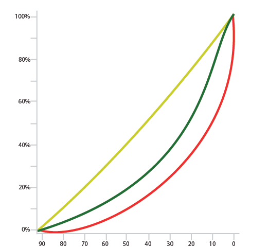
In a typical quarter, which we can understand from looking at a number of past quarters, revenue grows through the quarter. At the very start of the quarter 0% of the quarter’s revenue will have been delivered and at the very end 100% will have been delivered. Between these two dates there is a trajectory of revenue delivery. The way to think about this is that on any day of the quarter a certain percentage of revenue will be delivered. Not all quarters are exactly the same, so there will be some variation around that figure.

We refer to this picture as a benchmark. And it looks a lot like a banana! If you want the math behind it, the central line is a best fit to the historical revenue delivery, and the outside lines use the standard deviation to show a typical distribution around the central line. The green line is the central line, and the yellow and red show typical distribution from the central green line. We can create this chart for any organizational unit anywhere in the sales organization.
How do we use a banana chart?
The banana chart is presented as a record of revenue delivery in the past. We want to apply it to delivery of the forecast in the current quarter.
Let’s take some simple examples.
- We are on day 40 of the quarter and we have just received a forecast for the quarter. It predicts $1m. We have already achieved $300k of that total. The banana chart shows that historically we have delivered 30% of the total revenue for the quarter by day 40. So we are bang on target
- We are on day 60 of the quarter and we have just received a forecast for the quarter that confirms the previous forecast of $1m. We have already achieved $500k of that so we are half way there. The banana chart shows that historically we have delivered 60% of the total revenue for the quarter by day 60. If $1m is an accurate forecast, and the past is our guide, then we should have delivered $600k by this day. So we lagging by $100k.
Let’s look at this second example in a little more detail. We accept that 60% is the benchmark historically, but there is some variation over time. Perhaps the chart shows that figures between 55% and 65% are normal. Therefore we would expect between $550k and $650k of revenue by this day. We are $50k short of this lower figure. The forecast is looking like a stretch.
Even in this second example it’s not impossible to deliver the forecast, but it is a significant deviation from the past. As a result management should take a close look at how the forecast was created.
Both the examples above reference a forecast that has just been submitted. Once a forecast has been received the chart can be used daily to check that the forecast remains on track for delivery. A forecast might start off looking good but then could diverge from the revenue delivery seen on the chart. The direction of travel is important. The more warning you have that things are going off track, the more time there is to do something about it.
Bear in mind that a banana chart can be produced for every part of an organization. Every part of the organization commits to a forecast and the forecast delivery can be tracked. While the forecast for a team might be on track, a team member could run into difficulties. This is a very useful thing to identify, and team resources can be adjusted as necessary to ensure the success of the whole team.
The Pipeline Usage Banana Chart
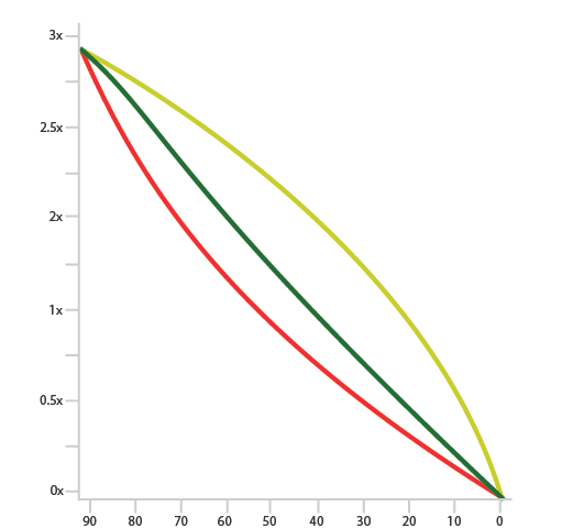
We have discussed a banana chart that tracks revenue delivery. There is one more banana chart to consider–the pipeline usage banana chart.
At the start of the quarter there is a pipeline of opportunities that we want to close in the quarter. We won’t be 100% successful, so the pipeline needs to be significantly larger than the amount of revenue we will end up with at quarter end. It is possible (depending of typical sales cycles) that new opportunities may be added to the pipeline as the quarter progresses. By the end of the quarter the pipeline should be zero. Everything that was in the pipeline should have been won, lost, or deferred to a future quarter.
The use of pipeline over the quarter also follows a characteristic shape. To build up the banana chart the pipeline over each previous quarter is divided by the revenue at the end of each quarter. This makes quarters easy to compare.

The way this banana chart is used is somewhat similar to the revenue banana chart. If sellers have been going through pipeline too quickly in the quarter then the loss of pipeline will be apparent. Too little pipeline one a day of the quarter implies that a better win rate is going to be required to achieve the forecast.
The two banana charts are used together. The revenue banana chart might suggest that revenue delivery is perfectly on track, but if there is insufficient pipeline to complete the quarter–we are not going to make the forecast. Once again, maximum notice is key. There might be enough time to generate new opportunities or adjust tactics if the danger is identified early enough.
Accurately Track Revenue Delivery
Many organizations continue to forecast badly, and lack of visibility and tracking performance is certainly part of the problem. The goal of the banana chart is to show progress and provide snapshots so surprises can be avoided and forecasting can become a more predictable process. Using these charts to review performance daily or weekly can go a long way in changing forecast outcomes.
Don’t blindly guess performance or wait until the last week of the quarter to see if there’s a chance of making the forecast. Understand what the numbers are telling you, make adjustments based on reality, and take knowledgeable steps to keep that forecast commitment.
Want to learn more about Vortini’s banana charts and how we accurately track revenue delivery and progress to close? Sign up for your no-obligation demo today.
David is the CEO of Vortini and is an experienced executive with extensive software and startup experience. He has over 30 years’ experience in various roles all in the enterprise software industry. Now his focus is sales forecasting and analytics.

