Every company tracks its revenues over recognizable periods of time (e.g. months or quarters) and will typically set targets and produce forecasts that they measure revenue delivery against. This blog looks at how to track a forecast using revenue delivery and pipeline usage.
The Typical Shape of Revenue Delivery
The way that revenue accumulates through a period is fairly predictable. It starts close to zero but frequently some revenue has been booked before the period even properly starts. So it may not be exactly zero on the first day. Revenue then increases through the period until it reaches a maximum.
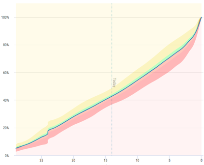
The shape of revenue delivery through the period is generally recognizable and frequently looks like a “hockey stick,” similar to the below image. Revenue accumulates slowly at the start of the period and then accelerates towards the end, resulting in the revenue accumulation curve climbing rapidly.

Typically, it looks like a hockey stick because the process is like this:
- At the start of the period there are opportunities that are a long way from closing.
- These opportunities progress over time and begin to close.
- Towards the end of the period the focus shifts to meeting targets, the focus is on opportunities that are most likely to close.
- The result is that by period end the pipeline has been drained of opportunities that are well advanced.
- A new period starts, the process repeats itself.
The shape of the revenue delivery curve is generally characteristic and will be repeated period after period. There may be some seasonal variation. There are some events that can affect the revenue flow, e.g. widely observed holidays. In addition, Q4 will often produce an outsized amount of revenue.
It should be noted that the exact amount of revenue in one period is not likely to be the same as in any other period. Businesses grow and decline over time. When we say that the revenue delivery curve is generally characteristic, we are thinking in terms of the percentage of final period revenue that has been delivered on any particular day. So, it starts around 0%, it ends up at 100% and the journey between 0% and 100% is characteristic.
Of course, the shape is not exactly identical across periods, but it is close. By looking at a range of prior periods we might see that on a particular day an average of 55% of the revenue has been closed, but in fact it varies between 50% and 60%. For every day of the period we can get the average and variation around that average.
The Typical Shape of Pipeline Usage
There is another characteristic curve that helps us understand a business–pipeline usage. To explain pipeline usage, let’s start at the end of the period. Pipeline is defined as the total amount of opportunities that have close dates in the period of interest. As we get to the end of the period, every opportunity that is within this definition of pipeline must either have been won, or lost, or had a change in close date that pushes it out of the period. Therefore, at the end of the period, the pipeline must be zero. Of course we nearly always see a non-zero figure because the CRM has not been fully updated. But at some point, the number is zero.
At the start of the period, the pipeline is full of opportunities that we hope to close. In terms of the shape of the curve as it inevitably gets to zero, it may not simply decline. Sometimes it rises until it reaches a maximum, then starts its decline. Whether the pipeline starts the period at its maximum, or whether the maximum occurs sometime later depends on factors such as the sales cycle length compared to the length of the period.
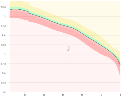
The important thing is that once again, the shape is characteristic and tends to be repeated. You will recall that all revenue delivery shapes look the same by working in terms of percentage of revenue delivered and in the case of pipeline, we do the same. We divide the pipeline by the amount of revenue delivered in the period. Therefore, on the first day of the period we might say that we have 5x pipeline – 5 times as much pipeline as final revenue. Or put it another way, we expect to win 20% of the pipeline and turn it into revenue.
The first image shows revenue delivery, and the second shows pipeline usage.


Apart from the curves that show the characteristic shapes that we have discussed, you will see the “clouds” that surround those curves. These clouds show the typical variation that we see over a number of months. If you’re interested in the calculation behind this, please ask.
So, Why Is This Useful and Important?
Let’s look at the day that is current in the revenue delivery example. It is 14 days from the end of a month. The chart shows that on average we have delivered 43% of revenue but variation between 36% and 50% has been observed over time. This is nice to know, but how does that help in the current period? I know I am at day 14, but I clearly do not know what the total revenue for this period is going to be, because we haven’t got to period end yet. All true, but we do have a forecast and the forecast is what we are suggesting we can deliver at period end.
Let’s work with this example a little more. Say the forecast is $10m, and the revenue delivered by day 14 turns out to be $4.3m, i.e. 43% of the forecast. I can say with confidence that we remain on track to deliver the forecasted $10m.
But what if we had only delivered $3m, or 30% of the forecast? Well, our understanding of history tells us that we have always delivered significantly more revenue on day 14. The sales team might say “but this time is different, just look at how much pipeline we have.” This may well be true, but closing opportunities takes time and that is why the revenue delivery curve has a characteristic shape.
An alternative example is, what if we had delivered 60% of the forecast? The question is now “why are we so far ahead?” If we normally hit 60% 8 days prior to period end, and pipeline is now at day 8 levels, then it looks like business is getting closed faster than usual. When we recalculate the characteristic curves, this will be taken into account. But if we have more normal levels of pipeline for day 14, then it looks like the forecast is going to be soundly beaten.
Use Historical Characteristics to Track Delivery of the Forecast
The purpose of using these characteristic curves is to understand whether we are on track to deliver a forecast, and this is right through the organization anywhere that a forecast has been made.
The first time we check these charts is when the forecast is submitted. Assuming that the period in question has already started, we can check whether the forecast is supported with history. It is possible that it isn’t, and it is possible that there is a really good reason why “this time is different,” but it leads to a discussion and helps assess the credibility of the forecast.
After a forecast has been agreed, the charts are continuously reviewed for any signs that the forecast is heading off track. If you don’t do this, and you wait until late in the period to see how things are panning out, then it will be too late to do anything about it. If you get the earliest possible warning that there might be trouble ahead, then you have more time to do something about it. You might do something as simple as asking for a new forecast, but you might also start to look across the organization to see how the shortfall can be made up.
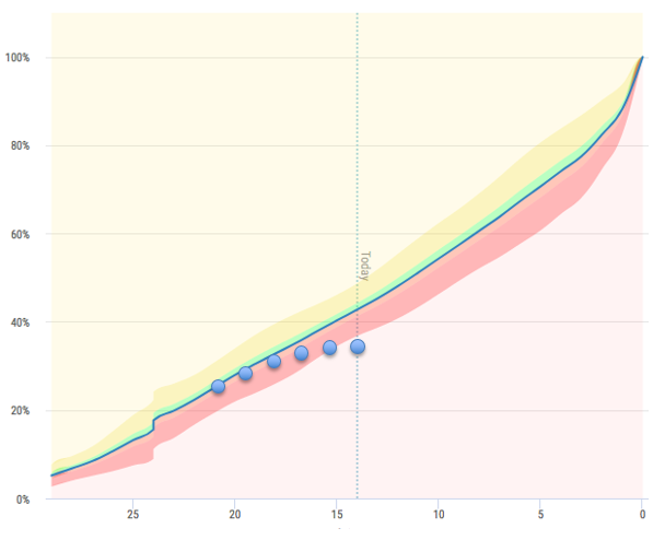
Take a look this this chart. Here is a forecast that looked great when it was made, but went off the rails. Wouldn’t you want to know that as soon as possible?
Final Thoughts
In summary, revenue delivery and pipeline usage are generally consistent over time and this knowledge can be used to assess forecasts when they are made and make sure they remain on track through to period end. If there is trouble ahead, and this is discovered early, the more time there is to do something about it.
To learn more about Vortini and our Early Warning System to track forecast delivery, request your demo today.
David is the CEO of Vortini and is an experienced executive with extensive software and startup experience. He has over 30 years’ experience in various roles all in the enterprise software industry. Now his focus is sales forecasting and analytics.


